Out with the old, in with the new! We've chucked Zoella and Hira out of the window and we've claimed the fort, well, at least for this week. Inia and I are certainly rookies at this job, but we're definitely awesome at being critical while we judge these books by their covers.
This week's covers were chosen by Hira, Zoella and Inia. Jordan just pitches in with her comments on each one.
 |
| The Chaos of Stars by Kiersten White |
Inia: I love the colour combination of this. The midnight blue and gold gives it such a mysterious and magical look; it reminds me of a wizard's cloak. The swirly font goes perfectly with the mystical theme that seems to be dominating the cover. This is the kind of book that I would place on the front on my bookshelf for the aesthetics but would keep postponing reading because looking at the cover and the tagline, this seems like a fantasy novel and I don't do fantasy.
Jordan: I would love to have a hard cover edition of this book. The gold against the varying concentrations of dark blue with the hints of silver have swept me off my feet. The way the title and the byline connect with the corner applique of vines and flowers makes it come alive. I would definitely get this book, if only to display it in my archaic bookcase.
 |
| Project Cain by Geoffrey Girard |
Inia: Ok, this looks pretty interesting to me. I have no idea what the book is about but it looks like a psychological thriller, going off on what this segment is all about; judging the book by its cover. The guy is looking at his reflection in a puddle of water and sees himself holding a dagger in it; looks pretty psychological thriller-ish. Or, considering the fact that Zoe selected this cover, it's probably a fantasy novel in disguise. Makes sense what with the title being in a spooky font and having the name Cain highlighted.
Jordan: Dark, murky forests, a seemingly shallow pool of water, that reflection (which for some reason, seems off), an eery moonlit night; what more do you want to set the ambiance for intrigue and danger. The font isn't my favourite aspect about this cover, but it doesn't make me cringe either.
 |
| And I Darken by Kiersten white |
Inia: At first glance I thought this was a dagger going through a rose and died because the dagger-rose symbolism means a lot to me (it's a fangirl thing and related to my OTP). On a closer look though, it looks like a spear penetrating a random flower (jeez the innuendos in that!!). I guess, objectively, the cover is pretty but it looks boring to me. And very fantasy novel-esque.
Jordan: I did a double take here, and then I magnified the cover to take in all its glory. This is gorgeous! The lavender and lilac petals look beautiful against the shimmer cloud and the dark backdrop. The glimmering spear piercing through flower, and the way the font is positioned is quite strategic. The attention to detail is noteworthy, what with the shaft engraved to look like a reptile-like creature. I'll definitely pick this book up for the cover.
 |
| First Life by Gena Showalter |
Inia:The tagline and the cover art makes me think this is a dystopian fiction type thing. Looks very depressing. The colour palette is very suffocating to me: this mix of dull sky blue and greyish violet. And somehow the shadows and contrasts make it ever more stifling. The hourglass looks pretty omnious as well. I wouldn't go 10 feet near this book if the inferences I made assessing the cover are true.
Jordan: This cover design is ingenious and awe-inspiring. That being said, I find the concept of the book confusing. Does this mean that the dreary world will turn into a bright one when the fast-ticking time runs out? And like Inia said, this seems to be exactly the kind of book that we won't pick up.
 |
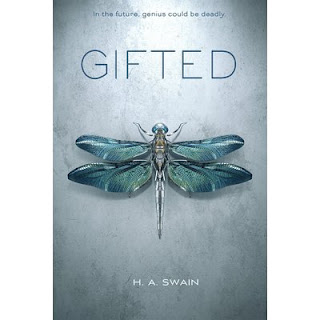
| Gifted by H.A Swain |
Jordan: It is a pretty cover, but not something worth picking up.
 |
| Unbreak me by Julieanne Lynch |
Jordan: Inia might be crazy about this cover, but I'll pass this up. It looks gaudy to me. It might redeem its worth as a hard bound edition, but for now, no.
Inia: This is such a cliche romance novel cover, I hate it! I can make better covers than this and I don't even know how to use basic Photoshop. Also what the hell is that font?! Did they put any effort into this cover at all? The writings on the cover are cluttered and too big. That emerald-black colour combination with that picture is pathetic. Am I being too hard on this cover? Good. Because it is not impressive at all.
Jordan: Inia checks all the boxes on the list of what went wrong with this cover. I wouldn't take a second look at this
.
Jordan: The ripple effect makes the underwater scene a very tangible one. The shimmer cloud makes it seem as though she is disintegrating in the water. This cover piques my interest, and I would like to find out how the female on the cover is related to Poseidon.
Inia: I think my favourite from this week's covers is 'The Chaos of Stars' (the cover I selected myself).
Jordan: And mine has been the cover of And I Darken
And that is a wrap. Today's Cover love saw a few hits and misses, but being judgmental (about covers, mind you) was quite fun.


No comments:
Post a Comment
Let us know what you think.