Saturday 30 July 2016

Book Nerd Problems #6


This week we have another awesome book nerd quote, courtesy of Hira (you are amazing H). This quote is something I go through almost every time I read a book. My main diet consists mainly of Urban Fantasy and UF is something that is dominated by impulsive and kickass female leads and I go through atleast one cycle of yelling at them. Of course they don't listen and jump right into the boiling oil. But, at least they are no damsel in distress. they clean up their own messes.


When did this last happen to you? For me it was during a Jeaniene Frost novel, in the series One foot in the Grave.


Friday 29 July 2016

Time Traveler's Wife by Audrey Niffenegger || #reviewfriday

It was the summer break of my eleventh grade and I was curled up in front of the television with the worst case of reader's block. So then the great man that my Dad is, he gifted me this book in the hopes off alluring me back to the world of books.

It was a weird phase for me, I was long over my childhood Harry Potter era and just through my embarrassing Twilight era and beginning to question my credibility as a reader. I wanted to read a good book but nothing seemed to capture my attention. And Sci-fi books were never to my taste.

So I began reading this with a huge negative mentality. But before I was ten pages in, I was engrossed, enraptured and enthralled,once again bowing down to the master of books that is my Dad.


Name: The Time Traveler's Wife
Author: Audrey Niffenegger
Genre: Science fiction, Romance novel, Speculative Fiction.


I found it extremely difficult to believe that this was Niffenegger's first novel. The journey of the book is so smooth even with all the to and fro's in the time periods. The novel told in alternating first person focuses on the love story between Henry De Tample, a librarian and Claire Ann Abshire, an artist who makes paper sculptures. 

What makes their story unique is Henry's genetic disorder which makes him travel through time involuntarily. The first time Henry meets Claire he is twenty- eight. But the first time Claire meets Henry, he is in his forties. The transitions between Henry's time-travels and his day to day life is beautifully handled and at no time does the reader feel confused or out of the loop.

Also the novel is presented in a very normal way and never do we think of Henry's time-traveling as a super power or anything. It's treated by him as well as those around him in the same way one would treat a normal disorder. Even the readers won't be able to see Henry's disorder as anything else. Such kind of easy acceptance of a foreign concept can be achieved only by brilliant writing.

The common misconception that having the power to go back in our past and change things will make everything right is overridden in the book. Henry's helplessness and his inability to control his 'jumps', especially towards the end caused some weird sensations in me as a reader. In fact the latter half of the book contained a whole lot of emotional scenes which made me tear up quite a bit. This was one of those very few books, which I finished with tears in my eyes and a smile on my lips.

It is now a major motion picture. I can't say anything about the movie since I haven't seen it. But as a firm believer of "movies never do justice to the books" I would advice everyone to read the book before spending two hours in front of the idiot box. 

Also Niffengger has revealed that she is doing a second part for the book which will release in 2018. I was skeptical at first because I felt the book was complete on it's own. But I have been reading more and more about it and it seems to be good. It's the story of Henry's and Claire's daughter and the grape wine is that there is a love triangle. I am excited. I will catch you all in 2018 with a review of Alba De Tample's tale.

Rating- 5/5.


Thursday 28 July 2016

Cover Love #8

Hi, it's Zoella. I had taken leave last week from Cover Love, but now I'm back.

 I love fantasy cover and believe that they have some of the best covers out there, in terms of colour palette, audience engagement and that elusive wow factor. But, I know that a lot of books out there, which are not fantasy  also have eye catching covers and I have tried to include it as much as possible. But, you know me, fantasy covers dominate most of the time. 


Anyway, I hope you enjoy this collection. And I would love it if you told me which one was your favourite and whether you want to nominate your favourite cover here?


A Pocket full of Stars by Patricia Mayweather ||Cover Love
A Pocket full of Stars by Patricia Mayweather

Zoella: I usually don't like the effect on the title because it hurts my eyes, but, somehow I love it here. The colour palette is eye catching but is not so in your face, it's more subtle. I love how they put the bylines in between the title. Clever.
 Oh no, I feel a headache coming. I stared at this cover too long. Onto the next cover.

Hira: There is something alluring about this cover. It seems plain at first sight but I don't know I feel like it is the kind of cover you come back and check out while walking through a bookshop. And I love the quote at the bottom.


Zoella: This is a cover that does it's job well. The long, luxurious hair, the tower in the background, the tagline, everything screams Rapunzel. This cover is pretty, but the attention to details and the story it tells elevates it to a whole different level. I love the font and the snowy background. The tagline here serves two purpose, one is telling the that it's about Rapunzel and the second part is intriguing the reader enough to pick it up. Hair of Gold, hmm, interesting.  

Hira: Okay I love the tagline. And of all the fairy tale adoptions, Rapunzel is the least common one from what I have seen. So if this is kinda different. I do like the wintery white feel of the cover but it's not very striking, as in I feel I have seen similar covers  before. I definitely judge books by cover and if I have come across this I wouldn't have spent much time on it just because I have seen lot of covers with a mysterious girl in front of it.

False Memory by Dan Krokos || Cover Love
False Memory by Dan Krokos

Zoella: When I saw this cover in thumbnail size, I thought two things. One: I love this colour and two: What the hell is it? And I didn't mean it in a this-cover-is-so-confusing-it-sucks kinda way. This one intrigued me and when I enlarged it, I was floored. The couple running shows danger, the whatever it is on top gives a very futuristic feel and the silhouette of the city(which they are running away from) and the fact that the size of the couple is quite small leads me to conclude it's a high stakes, dystopian kind of book. This cover works for me, except the font of the title. I absolutely hate it. What is your opinion?

Hira: I think I would like to cut the cover into two pieces. I love the top part- the color the weird symbol and all. But the bottom part not so much. I am not a fan of that font either. And the city background with people running is quite used.
First Rapture by Alexandra Ivy || Cover Love
First Rapture by Alexandra Ivy
Zoella: It's a tried and true palette and a tried and true theme. I find nothing to be excited over, But, that said, I believe this cover would do a stellar job of attracting romance readers

Hira: Zoe you hit the nail on the hammer about attracting romance readers. Throw away romances are my guilty pleasure and this book would certainly hold my eye. Also I love the use of red against the black and white. It's quite used but there is a certain dangerous allure to it.

Zoella: P.s: it's your favourite colour combo too.
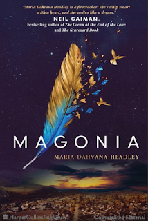
Magonia by Maria Dahvana Headley || Cover Love
Magonia by Maria Dahvana Headley

Zoella: This cover is so AMAZING. I love the colour palette. But, the feather, it is the feather that takes my breath away. I could stare at this cover for hours. But, as much as I am excited about the top part of the cover, I can't muster the same amount of excitement for the bottom part, It looks too separate, too lonely.

But, the most eye catching part of the book must be name Neil Gaiman. Due to the contrast the name uses, it's easier to read Neil's name than the actual author's.

Hira: That feather. OMG I love that feather. But again the same pattern...the birds flying away from the feather. Isn't this the fifth cover here with that style? But I think out of all of them I like this one the best. Also Zoe is right about the writer's name being less visible. And the bottom part...I wouldn't even have noted it if Zoe hadn't talked of it. There seems to be a disconnect.

Nocturne for a Widow by Amanda DeWees || Cover Love
Nocturne for a Widow by Amanda DeWees
Zoella: This cover makes me wanna use words like magnificent, stupendous, absolutely brilliant. I don't give praise lightly and this praise is not just for this book(which is beautiful on its own) but for the entire series. This is series branding at it's best. Go check out the rest of the book in this series, I'll wait.

I will leave the critique to you. What do you think?

Hira: It's unique. I will give that. I love the middle part the outline of the woman and the scene inside. But for some reason I don't feel blown away by it though I am huge fan of the palette. And especially the green which used. 


Piecing me together by Renee Watson || Cover Love
Piecing me together by Renee Watson

Zoella: It's an explosion of colours and because the background is so colourful, the designer brilliantly gives the title a pseudo transparent look. But, even though it's colourful and pretty, we instantly know this book is not just about fun and good times from the expression on the girl's face. It has a very literary book feel. Usually literary book are more minimalist in nature with a limited colour palette, but the expression on the girl's face gives off that kind of vibe.

Hira: Not an easy read. That's the first thought this book brings to my mind. It's colorful and vibrant but for some reason the woman's face tells me it's anything but that..

A Crown of Wishes by Roshani Choksi || Cover Love
A Crown of Wishes by Roshani Choksi


Zoella: Honestly, I like the cover of the first book better( we had featured that in our first cover love). The cover is not bad and is leaps and bounds better than most of the covers out there, but the first cover did it better in terms of colour palette. I am adding it below for your reference.

Hira: I like the palette but this is not my type of cover. The font appears regal (my favorite kind- as you would know by now).

The first book had a stronger contrast of colour and the title dominates the cover. The colour palette of the second book is strong on it's own but the title does not dominate the cover. I have nothing against that kind of title, but since it's the second book in the series,it should have followed the first in terms of series branding, i.e the dominant title. But, the other elements like the gold border and the kingdom in the background follows the series and I am pretty happy about it.

The problem is, I was preparing to get overwhelmed and I just wasn't. Do you love the cover or where you underwhelmed like me.

P.S: Love the train of her Anarkali, which is something they could have used the first book too.


Hira: I kinda feel that the reddish gold part and the midnight blue part should have had equal portions of space. It feels as if the designer was conflicted and could not decide if she wanted a cover dominated by title or not. So this ended being  a compromise I feel and I am not happy. I believe it would have looked much better with more red and gold in it.

Zoella: Maybe, but the purpose here is to highlight the details. Because, red and orange is so sparsely used, it immediately attracts the eye to the castle, which would've not even been noticeable otherwise. Also the rich midnight background provides a nice contrast for the girl's sari and lantern.

Zoella: My Favorites this week were Towering and Nocturne for a Widow. What was yours Hira?

Hira: I think my favorite is Magonia. Which was your's lovely reader.


Sunday 24 July 2016

Book Nerd Problems #5

Harry Potter has one of the biggest and most dedicated fandom's in the world. Even after ten years the fandom is still active and thriving. So this week's Book nerd Problem is dedicated to Potterheads all over the world who still keep the magic alive in them.


And also I hope all of you are as excited as me for the release of Harry Potter and the Cursed Child next week...have you pre-ordered the book? Anyone in London going to the play? If yes, then I am so jealous of you...Tell me all about it. I am as big a potterhead as they come.


Friday 22 July 2016

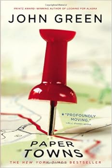
Paper Towns by John Green || #reviewfriday

This is another one of John Green's books turned into a movie, and I wonder if I should've gone for the two hour movie rather than the two day book reading experience. This doesn't seem to bode well. However, I don't entirely regret reading the book, as I probably would have skipped right through the movie as Q and his friends went on a wild goose chase.


Title: Paper Towns
Author: John Green
Genre: Young Adult, Coming of age

Before we begin, let's take a look at where the title came from.


[Fictitious or fake entries are deliberately incorrect entries in reference works such as dictionaries, encyclopedias, maps, and directories. There are more specific terms for particular kinds of fictitious entry, such as Mountweazel, trap street, paper street, paper town, phantom settlement, phantom island, ghost word and nihilartikel. (Souce:Wikipedia)]

So,in a line, this story is about Quentin 'Q' Jacobsen trying to find his childhood crush Margo Roth Spiegelman after she runs away from home. There are intricacies and subplots in the novel, and the chase is beautifully crafted, but the book was a rather  lackluster read. And I really don't know what to point out that caused my disinterest. 

Perhaps it was the philosophic tint (more like a full blown out paint job) to the book. Margo (mostly referred to as 'Margo Roth Spiegelman' throughout the high school hallways and in Q's mind) and her word vomit (yes, word vomit) on 'paper towns' and 'paper people'-- the idea of being flimsy, weak, and one-dimensional; the way she went about escaping the 'paper'-ness of the world; all of it did  not make her a like-able character for me. I thought of her as being flighty, immature, and selfish. By the time Q's perception of her as Margo Roth Spiegelman, the most amazing being to grace the earth, toppled; I could not help but think, 'I told you so'.   

The graduation parties, the prom, the different kinds of parents, all of these were the same old ideas that did not offer anything new. Well, except the world record for hoarding the most number of black Santas,

Final words: all in all, not a satisfying read. If you are the kind of person that enjoys a lot of philosophic 'bark and no bite' (because I did not see any action to substantiate all that speech) then this book is for you, but unfortunately, not for me.

Rating: 1/5

Thursday 21 July 2016

Cover Love #7


Once again it's my favorite day of the week Cover Love Thursday! Yeeey! I swear, this is my favorite feature of all and I would like to take a moment to personally congratulate Zoella for coming up with this brilliant idea...(I know, I was shocked. Who knew that pretty little head had so much stuff in it! Shocking). 
But, unfortunately she won't be joining us this week. But, she has sworn on her Ilona Andrew's books that she will be here next week.

Anyways, lets begin. *Cue Drum Rolls*


Cover Love Week 7


Reckless and Ruined by Bethan- Kris || Cover Love
Reckless and Ruined by Bethany-Kris
 Hira: My favorite color combo. What's not to love about this cover. This is the cover of the second book of Chicago War series...remember the last week cover? I told you that I will try to put up the other covers...remember now? I love the fact this cover is utter chaos. And I am taking that it alludes to blood and smoke (maybe gunpowder)...totally the scene of a war. And the lady in the middle..bet she is right in the thick of it all.


The Shadow Hour by Melissa Grey || Cover Love
The Shadow Hour by Melissa Grey

Hira: The yellow on flame palette is what pulled me towards this cover. Also the shapes arising from the flame, The phoenix and the black shapes on the side? Is it wolves or maybe dragons (or I am too obsessed with game of Thrones...LOL) Also love the font.

Twisted by Hannah Jayne || Cover Love
Twisted by Hannah Jayne

Hira: I think what I like about this cover is its aura of mystery. It is twisted...the cover conveys that much. There is dark but there is light too...so is dawn or dusk? Who knows. Also the silhouette in the whole Sherlock Holmes getup...whats the story there? Interesting isn't it? The font is minimal still striking.(Am I the only one who noticed that the title has a shadow?).

Sheva by R Lee Walsh || Cover Love
Sheva by R Lee Walsh
Hira: Serious Game of Thrones vibes...don't tell me you can't see it! The whole thing reminds of the white walkers...Okay even keeping that aside, this is one damn cool cover (*pun not intended*). And the font stands out perfectly. Definitely a favorite of mine.

Her Black Wings by A.J Norris || Cover Love
Her Black Wings by A.J Norris

Hira: I am not usually a fan of this style..but something about this cover appealed to me. I am sure Zoe would have more to speak of this cover than me since it's her forte. But I just wanna say that I love the name of the book as well the whole feel of the cover. I mean...the girl is dark. She is no goody two shoes and that's my favorite kind of heroine.

Feverborn by Karen Marie Morning || Cover Love
Feverborn by Karen Marie Morning

Hira: Are you even wanna ask...I love red. I love the cover. I love the whole palette. I love the whole  overused clique of a Red Riding Hood lost in the deep mysterious forest. Don't judge me. Who cannot love that shade of red?

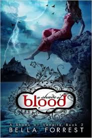
A Shade of Blood by Bella Forrest ||Cover Love
A Shade of Blood by Bella Forrest

Hira: Why does this cover remind me of an ancient Indian princess waiting for her prince on a full moon night? There is this whole aura of mystery and magic in the cover. The blue-white combo does that. I didn't really like the font in which BLOOD is written though.

Starlark by Cael Percy || Coverlove
Starlark by Cael Percy

Hira: Is it just me or is red dominating this week's covers? I am not complaining though. While I liked the font as well as the cover, I don't really connect with it. Like it's a time travel romance right? But why does it look like a historical romance instead? Maybe once you read the story the cover will be justified but at a glance, there seems to be a disconnect between the cover and the genre.

So that's it for this week. My favorite cover were Sheva and Feverborn. What how about you?


Saturday 16 July 2016

Book Nerd Problems #4

Every fan have to suffer this. When we hear that our favorite book is going to get adapted as a movie. We celebrate it like lunatics, I had. We countdown the days till movies finish, make plans with fellow fans to catch the movie on its release day. rereads the book, hyperventilates on the thought of seeing on favorite scene come to life, buys popcorn, hyperventilates again. Finally, the moment comes near, you see your favorite scene in multi color, and...


It's nothing like you have imagined.

So, this one is for all the fandom people out there. Have you gone through something like this. Tell me.


Friday 15 July 2016

Scorpio Races by Maggie Stiefvater || #reviewfriday

I have to start with a warning. I read this book after much hype, so I can't decide whether it influenced my reading in anyway. But, I will try to give you an unbiased opinion, as much as possible.


Title: The Scorpio Races
Author: Maggie Stiefvater
Genres: Fantasy, Y.A, Mythology

It happens at the start of every November: the Scorpio Races. Riders attempt to keep hold of their water horses long enough to make it to the finish line. Some riders live. Others die.

At age nineteen, Sean Kendrick is the returning champion. He is a young man of few words, and if he has any fears, he keeps them buried deep, where no one else can see them.

Puck Connolly is different. She never meant to ride in the Scorpio Races. But fate hasn’t given her much of a chance. So she enters the competition — the first girl ever to do so. She is in no way prepared for what is going to happen.
 

First of all let me say I adored the relationship Puck and Sean shared. There was no Insta Love, she was no Siren that bewitched men and he was no bad boy that seduced woman. They were ordinary teenagers brought together by extraordinary circumstances. They were not made of ink and paper but was made of flesh and blood. The stakes are high, as both Puck and Sean need to win this race, but only one can. Both will lose something precious to them if they even came in second place.

I was skipping through the pages, racing to find out who won, because honestly I couldn't tell how the author was going to give them a happy ending, or if it was even possible.
So, did they get their happy ending? I am not telling you. *evil grin*

The first sentence had hooked me in, but I was underwhelmed by the first few chapters, maybe because I was expecting a more lyrical language. But, then I set aside my expectations and immersed myself in the story. There were so many times I could relate to Puck as a girl, I teared up a bit when she was humiliated but cheered even more when she stood strong. She doesn't have a flawless personality, she is a headstrong girl with short temper. But, I loved her all the more for it.

Sean's character is written so well and their romance ark was written so subtly that you didn't need a secondary character to point out that those two cannot keep their eyes off each other. But, there is no instant love, romance is developed over the entire book( 400+ pages), and blossoms after at least three quarters of it. Which made it more believable for me.

There were so many secondary characters, but they were very well written so that their personality shined at every opportunity you met them. Maggie, is an amazing author. While I prefer a bit more mystery, I think this book was worth my time.

When I finished the book, I was a bit angry, Why were there so many loose ends? But, then I thought back and discovered that there wasn't any. I just had to infer them from earlier conversations and thoughts. So, while I really like d the book, some part of me is a little underwhelmed by it. Side effect of too much hype. Nevertheless, if you are a young adult fantasy fan, I wholeheartedly recommend this book to you.

Rating: 4/5

Now tell me, which book did you read last?


Thursday 14 July 2016

Cover Love #6

Hey, how was your day. I had a blast designing some bookmarks. 

It was easy and yet hard to select the covers to shower our love on today because we had so many awesome options to choose from. We ended up making advance drafts for the coming weeks too, because we couldn't let go of the other covers. This is going to be the hardest that I ever had to choose my fav covers from the eight featured below.

Do you like today's banners? It's rainbow themed in support of LGBTQ.

Cover Love-Pentatwine blog

Let's move directly onto the main course, shall we?


The Assassin's blade by Sarah J. Maas | Cover Love
The Assassin's Blade

Zoella: It was really hard to choose between this one and the cover of Throne of Glass. Both are so kickass. This one won because of the rich purple cover, which is a personal favorite of mine. Maybe I will the feature the other next week. What do you think? Should we feature it here?

I love the font in which Throne of Glass is written at the bottom. It's so pretty. And the illustration itself is like the epitome of kickass female heroins. With that hood covering her face and curved blades by her side, who won't say that she is an assassin?

Hira: To be honest, this is not my type at all. Zoella loves her kickass heroines...so I am sure this would have been a cover which I would have suggested to her if I saw it in a bookstore. But to my eyes, all these type of covers mostly blend into one...especially if the palate is a blue-white combo. So I am not a fan of this cover though I liked the Throne of Glass font like Zoe.

Illusions of Fate by Kiersten White | Cover Love
Illusions of Fate 

Zoella: Kersten White's fans are the luckiest in the world, because along with beautiful stories, they get beautiful covers too. Check out her other books, all of them have amazing covers. This one for example, from the Mona Lisa smile on her lips to the birds taking flight to the glowing font, it's simply beautiful. I want to buy all her books just for the cover. What do you think H?

Hira: The birds flying out of inanimate things seems to be a common cover idea these days. Its the fourth cover of the type we are posting I think. But even though its not unique it is still very intriguing. I love your description of the girl Zoe...very apt.


Hush, Hush by Becca Fitzpatrick | Cover Love
Hush, Hush

Zoella: the cover had caught my attention, long before the author's success had and this is the book that helped her fly to the very peal of the bestseller charts.In most angel covers. we usually only see abs and a bit off the wings and that's why this is so different. The angel is midflight and the way he falls along losing his blood stained feathers add a real depth to the cover. I love this cover, because it tells a story, an intriguing one at that.

Hira: The fallen angel..it's a concept which has always caught my interest. But for some reason I have never read any books of that theme. Maybe this is the place to start. I love a black palate. And this one is really really intriguing. The way the angel is falling..as Zoella noted certainly gives the cover a lot of depth. Also I love the font, the silvery white with that magical touch in style is very attractive.
Mechanica by Betsy Cornwell | Cover Love
Mechanica

Zoella: I hadn't noticed the gear at first. My first thought was it was so pretty, but so typical. Then I saw the gears and the kingdom beneath her and the special font and I knew I had to include it here. Because even without all the details, the cover was a pretty one. But, what the details does is that it screams at the top off its lungs that this is a steampunk novel. Which makes it so much easier for the fans off the genre to find the book.

Hira: Yes, this cover did seem quite typical at first glance. But when you look properly we see the details and those are what creates the intrigue in the readers. The font is quite stylish and sparkly and surprisingly I like it.
The Story Book of Legends by Shannon Hale | Cover Love
The Storybook of Legends

Zoella: I have read Shannon Hale's Princess Academy and she is a very good writer. I wasn't very impressed with some of our covers, but this one caught my eyes. It looks like a magic book that can whisk you to any place you want, real or imaginary, within seconds. I've always wanted one of those. The centre piece of the cover is stunning with its rich details. We are looking at the two girl's through the keyhole while there are two keys side by side,  just above the girls portraits. And the girl's itself look good, especially the violet head, almost like dolls. Of course later I found out that she wrote the character description and all based on Mattel's (Barbie's company) line of dolls (they had contracted her to write the book.) She is an amazing writer and I have no doubt, this book will be amazing too (If anybody wants to buy me this book, you are welcome too).

Hira: Not at all my type. It gives a vibe of being too girly or childish...and as a tomboy this is so not the book for me. Also the violet-gold combo-no. Definitely no. The only part I liked even a bit is the keyhole and the view from that.

Spindle Fire by Lexa Hillyer | Cover Love
Spindle Fire

Zoella: I saw this when I was searching for another book and was immediately captured by the understated and subtle elegance of the cover, which is mostly because of the colour palette it uses. I like all the elements except the font used for the title. I feel it's too plain to match the rest of the cover. What do you think?

Hira: I love the palette...but somehow the overall cover does not give me a want-to-buy-this-now vibe. The slight goldish touch was a nice attention to detail and quite beautiful...especially the crown and the smoke around the author's name.


Zoella: Good choice Hira. This is bit of a departure from the usual covers we see in this genre. Usually the explosion of colours is limited to just the font or the background, but here it has taken centre stage and the end result is very cool.

Hira: Isn't this gorgeous? This is the cover for the complete series but each book has a separate cover...and all of them are so pretty. Do check them out...I am gonna try and post at least one more cover of the series next week. 
Now to talk about this one. The font...blending in so well, the same color as the background. The controlled explosion of colors on a largely blue palette. What is not to love about this cover?

Zoella: Why do I get a feeling that you are going to choose this as one of your favorites this week *grins*.


Zoella: There isn't much going on with the cover, but the colour palette used in rich in warm golden hues, which gives her an untouchable and yet a girl next door look. I know, they contradict each other, but that is what this cover evokes in me. Hira is more of an expert, when it comes to covers like these. So, what do you think H?

Hira: I will be honest. I haven't read the book...I was just randomly browsing for good covers and this caught my eye. And Zoe, you won't believe how right you are! The girls's character seems to be exactly like you have described...or so I gather from the synopsis. I can't pinpoint why I chose this cover...I loved the regal look it gave off-very sophisticated, yet the flash of skin shows that this is not exactly a book for nuns. Also the font-I love these kinds of font.
This books is for only 18+ audience and has BDSM undertones...just a warning.

Hira: So my favorite cover of the week was Chicago wars and Hush Hush. What about you Zoe?

Zoella: Oh man, it's so hard to choose between the first four covers. I think I will go with Mechanica and Illusions of fate or maybe Hush Hush. Gah, I can't decide between them. What about you?


Saturday 9 July 2016

Book Nerd Problems #3


Hi, how was your day. I had a few good ideas for making bookmarks. I will post it here as soon as I finish it. So, todays book nerd problem is special and I think you can guess who I am talking about here. If you know, let me know in the comments below.


"When your favourite author is so successful that he is finishing movie scripts instead of the book."

Why don't you tweet this one? Let's see how many of your friends are as smart as you.


Thursday 7 July 2016

Escapade by Dolce || #reviewfriday

You know how we all have these few books that we turn to when we are in desperate need for some comfort, something for when life gets tough and you need to get going?  Yeah, Escapade is one of those books in my Emergency-Save-Me-From-Jumping-Off-A-Cliff-SOS list.

Flunked an important exam? Read Escapade. Just went through a bad breakup? Escapade is the answer. Your boss is being a megalomaniacal douchebag? Grab your copy of Escapade and remember you won’t look good in prison clothes. Every time I read it, I go into a deeply relaxed state of mind; it’s like going to a spa and getting the most expensive treatment there. Except, this is a cheaper alternative.
https://www.amazon.com/Escapade-Dolce-ebook/dp/B01DB1S0BK/ref=tmm_kin_swatch_0?_encoding=UTF8&qid=&sr=#nav-subnav


Title: Escapade
Author: Dolce
Genre: Romance, Adventure
Warnings: Prostitution, mild implications of violence.

There is nothing complicated in this book. No murders, no unnecessary angst, no whiplash-inducing plot twists and no heartbreaks. This is pure, unadulterated fluff and well-written sexy times. But, it is not one of those chick-lits with no plot and zero character development either. Escapade has an extremely well-developed storyline and amazing characterization, beautifully interwoven with the desirable elements of a romance novel and the end result is a masterpiece.

  Reading the summary on Amazon, Escapade sounds like a cliché Pretty Woman adaptation but believe me, it’s not. The ‘businessman-falls-for-escort’ trope is something I cannot stand, but this book was a unique experience and had a bare minimum of parallels to the usual novels of the kind (No piano scene! Thank god).

 Lucas is an archetypal corporate businessman at the peak of his career. You know the drill; married to his work, can’t remember the last time he had any action other than with his hand and answerable to a mom who is still wondering why her gorgeous and successful 29-yr old son hasn’t brought anyone home to meet her yet. He’s filthy rich, of course, and undeniably handsome but destined to live the single life because he has no time to mingle. He had adapted pretty well to a lonely lifestyle,  with only his adorable dog (Georgie; he’s a very important character) for company, when one fine day, the universe decides to add insult to his injury.

 Lucas’ best friend and ex-lover Zamir has spontaneously planned to have a destination wedding in the Bahamas and he has invited not only Lucas and his entire ginormous family but also....his plus one.

 Talk about pressure. Well, coincidence meets fate and Lucas has an unexpected encounter with a gentleman (of the night) the very same day he got the call from Zamir. Jack McQueen is charming, self-assured and stunning. And he is very willing to play the part of Lucas’ pretend boyfriend and save him from the endless nosy questions and sympathetic glances he has to endure every time he attends an event alone.  Lucas has a deal; he won’t require Jack to do any sexual things, he just needs to accompany him to a fun-filled vacation in a summer paradise. What escort in their right mind would deny such a sweet deal?! Not Jack. Once they are in the Bahamas though, the vacation is nothing like either of them expected. But it sure does turn out to be the best summer of their lives.

  If I had to use one word to describe Escapade, it would be sunny.

In all connotations of the word. Everything about this novel is bright and dazzling, and warm and bubbly. The characters and their relationships with each other, the atmosphere, the setting, the tone; everything is so balmy and beachy.  It truly lives up to its name by being an escapade to a place where the sun is bright and the wind blows gently through your hair and your only worry is if you might tan too much and end up looking like a fried sausage.

That is probably why I find it so relaxing, why it is my comfort read.  Escapade is so scintillating it penetrates through the clouds of stress and the air of melancholy that might be surrounding one and succeeds in infusing some sunshine into their dark aura. I would definitely recommend everyone to go read this NOW.   

Rating: 4.5/5


Cover Love #5


Another week has gone by..time truly flies doesn't it? But who is complaining when we have eight beautiful covers waiting to be displayed every week. So usual without much ado...lets begin!


Let's see this week's beauties, shall we?

House of Ravens by Karpov Kinraid ||Cover Love

Hira: I haven't seen many covers with this kind of palate. The contrast is very striking. Also note the amount of detail put into it, the hair of the girl becoming birds at the ends, the flower like design along the copper colored parts of thee body. It's all very intricate. I also liked how they kept the font quite simple, only giving a bit of details to the 'O's. 
Zoella: This is a pretty cover. But, I like the cover of Court of Nightfall by the same author more than this. That said, I like how they have adopted a minimalistic style in everything from the colour palette to the font and still managed to add tiny tiny details to make it stand out. I love golden silhouettes of the birds arising from her hair.


Never Letting Go by Christina Channele||Cover Love

Hira: Like most people what struck me about this cover was the blue hair tinted red in the end (or is it the blue camouflaging the original red hair? seems more likely). The blue and white palate as we have said in the earlier weeks is very very striking. Also the font spread out all over the top, very carefully containing the big title, making it blend in.

Zoella: I have mixed feelings about this cover. I like the colour palette and I love the typography. The font used is beautiful. But, I can't make sense of what the blue part is; clouds, smoke? That annoys me.
But overall I like this cover. It's beautiful.

Idol by Kristen Callahan||Cover Love


Hira: From the very cover it's evident that this one is about music and probably the hero is a rockstar. But unlike other covers of same trope this one gives a different vibe. The name itself seems to carry a weight...a not so positive connotation. And the rainbow of colors covering the palate, recreating a concert scene looks really good. The font is again simple and blends in with the whole cover.

Zoella: Did you just read my mind Hira? I have seen a lot of books in the whole badass rockstar genre, but this one is in a class of its own. The rainbow coloured smoke gives us a feeling of attending the concert and they way he poses, as if he has just finished the best performance of his life and is now listening to the ear-splitting shrieks of his fan gives out total badass rockstar vibes. I also love the title, it has managed to show exactly what the book is about. I love it when that happens.


Beautiful Redemption by Jamie McGuire||Cover Love

 Hira: At first glance, I didn't really like this cover. But then I noted how the feathers spread out into little birds at the ends...much like in cover of House of Ravens. Surprisingly the brown-blue combination looks good though its not a favorite of mine. I didn't like the unnecessary adding of the yellow color to the font.
Zoella: I like the silhouette of the birds emerging from the wings (kinda ironic). This seems to be popular design option now. But what bugs me is that, even though it's a beautiful cover, it screams the wrong genre. Because this book gives off serious fantasy vibes. If I hadn't read the other book in the series, then I wouldn't have known that it was contemporary romance. 
Beautiful cover, wrong book.

The Curse of the tenth grave by Darynda Jones||Cover Love

Hira: If you want to be striking, I think yellow is the way to go. It pops into your eyes, just like this cover does. Notice the ghost figures at the bottom of the cover. And the rings...it gives of a vibe of a comedy. I love the font though I don't like the violet color in the title.


Zoella: I am not a fan of this cover. But I like the title(intriguing) and the cute charms hanging of the wine glass stems.


Weighless by Kandi Steiner||Cover Love

Hira: It's a unique cover which does not give much away. And is intriguing for that very reason.
Water is seen in the bottom along with long hair and a hand. Is it a girl who is floating in water?

Zoella: If you ask me whether I like this cover, I would say hell yes. If you ask me, why? I won't have an answer. So, I am adding this one to the I like it even though I don't know why section. And let me tell you, there are very few covers there. Why do I like this cover?

Hmm, must be the hair.


Blue Lily, Lily Blue by Maggie Stiefvater|| Cover Love


Hira: I love everything about this cover. The white, green and blue combo. The mix of nature and woman on the sides. The font, the title....it's perfect. It's not a usually seen style or design but the overall effect is quite alluring.

Zoella: I adore Maggie Stiefvater, both her writing and her covers.Featuring Maggie's cover is always a moment for me to fangirl. If you like fantasy and haven't yet read any Stiefvater, then why are you even alive. Try her Raven boys(series) or Scorpio races(standalone).

Okay enough fangirling, onto the cover. First of all, I like the girl's hair. It looks very unstyled and extremely real, even though the girl is green. I like how they have incorporated all that flora in it. Also see the translucent birds flying above the title and the triangular slashes(which kinda is the series symbol). Beautiful details. Don't have to say twice that I love this cover, even though I like Raven King's better. It was features in our previous cover love, which had a blue theme.


Hira: I love the fiery red hair which looks like flames when you look from the bottom. See how the castle looks like it's burning down. Very clever. Also love the font. As I have said before, I always love a very regal looking font.

Zoella:I also love the font Hira, it's bold and fierce. And the golden design where author's name is written is quite beautiful and goes with the overall colour palette. The fire and her hair is interwoven seamslessly, so much so that you don't know where one starts and the other ends. And there is a beautiful castle as bonus.

Zoella: My favorites were Idol and Weightless. Which was yours? 
Hira: Zoe, I loved Idol too...but my other favorite is The Irish Princess.

So that's the end of this week's cover love...which was your favourite. Tell us. Don't keep it a secret now. We are all ready to hear it... if you know pretty and unique covers, let us know in the comments. You know it's a crime to hide pretty covers.